If you are new to designing, then some of these options may shock you because they are so simple. A good web designer knows these rules and follows them to make their sites look beautiful.
How to make your website look better? First design with the audience in mind. Always make sure that your site meets the design standards of modern design tests. Also keep things like formatting, titles and images consistent across the site. Finally, always make sure that your site looks great professional designs and copy.
In this article we will go over a website design checklist to make sure your site look amazing. Simple changes you can make to improve the look and feel of your website while also keeping your customer and clients in mind.
1: Keeping Constant Fonts throughout the Site

While this might seem like a simple rule, people bad at web design often break many simple rules which makes everything worse. One rule that can not be ignored is fonts, so we have broken each of these rules up into their own rules because it’s easier to make changes.
Always keep fonts variants down to a minimal of two to three fonts per site. Less is better, if you can handle two that will work too. Trying to use four to five can be a challenge since the fonts will clash and make the site hard to navigate. Anything above that is just obsessive and serves no purpose unless you are a font site.
So two fonts should be what you aim for, something for heading and something for body. I really like using this website which pairs fonts together called fontpair.co.
2: Font Weights and Sizes
Because the web is such an open place, there are no hard rules to the sizes your website should use for fonts. You can pick any size you want because that is how unlimited you can be. Want a site with 40 pixel fonts throughout, you can do it but should you do it? No.
You need to balance your body font with your headings sizes. Worse case scenario you can use default sizes which are okay but it all depends on the fonts on your website.
I would recommend that if nothing else, h1 is bigger than h2 which is bigger than h3 which is bigger than h4 which is bigger than body font.
3: Spacing
A reason so many sites suffer from bad design is because of spacing. You need to give things room to breathe when you are designing anything and that includes headers, paragraphs, images, sections, icons and much more.
Things need space to feel like thing are not crammed together unless you are going for that look. Space things out so you can make sense of the website without straining your eyes or wondering what should be with what.
The Non-Designer Design book is one of the best books I’ve ever read on design and general rules. I recommend it wholly, nothing will make you design look better than reading that book.
4: Contrast
When you are designing a page, you need to make sure you spend sometime making things really stand out. There needs to be enough contrast that the page doesn’t blend. Many web designers will use sections that are colored differently or break up large blocks of text. This works both text and images by making sure you are keeping a balance.
There is nothing I can do to show you this, you just have to look at the page itself and ask, is this enough?
5: Don’t Center Text
We can use centered text for some circumstances but the times when this comes in handy is usually rarely. Centering text is something that should be avoided but always test right align and left align text first.
If the text or image looks good centered, then keep it but don’t center everything down a page. More often than not you find that if you just left align or right align something it looks much better than centered.
6: Keep Images constant
Keeping your images constant through a website is hard to explain until you see someone who breaks this rule. An example would be someone who is blending both black and white and color photos. Use one system or another but never use both otherwise you will suffer a disjointed look among your design.
7: White Space
White Space is an area where it can make your website look better with little area. Similar to spacing things out correctly, white space is the use of blank space to draw the eye to an area that is more crowded or contained.
When used correctly this can have a great impact not only the design but the overall look and feel of a website. Always consider white space as something you should use for every website no matter the plan.
8: Color Scheme
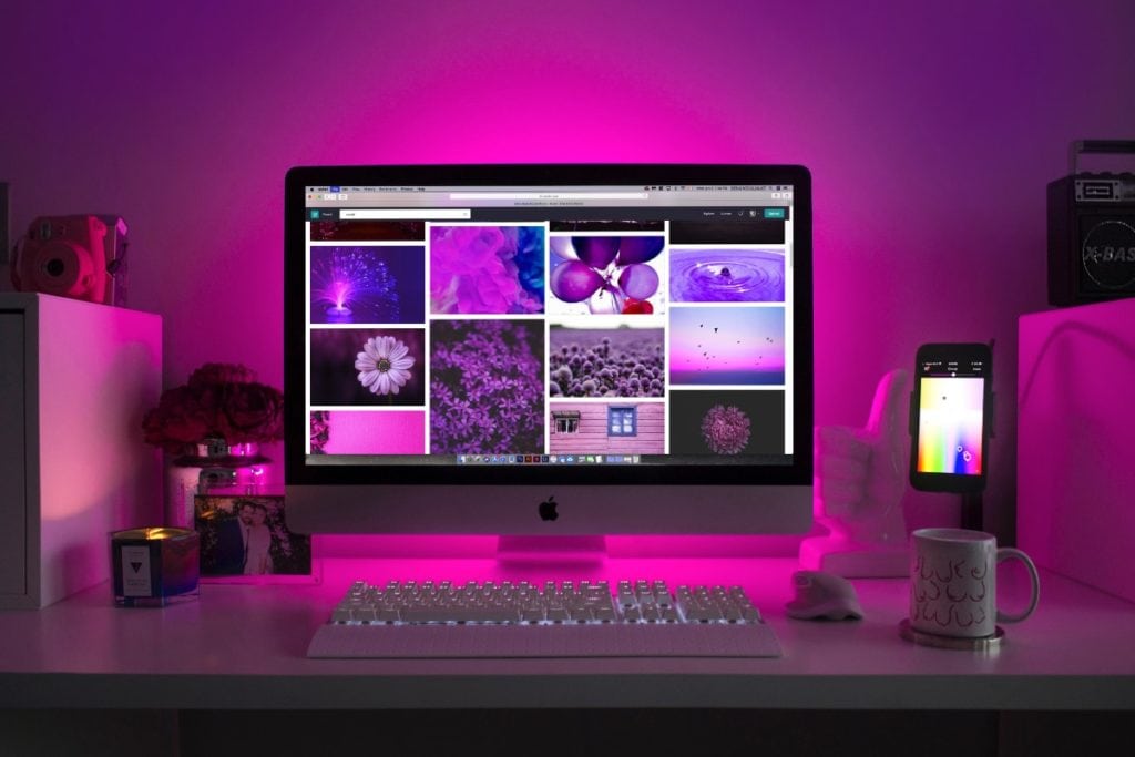
When you are picking a color scheme, there is a science that just can’t be expressed. Like fonts, less is more but you don’t want to go and use too few colors that the contrast becomes too hard for a reader to navigate the site.
Also picking the wrong colors can have a negative effect as if you pick all neon colors you are more likely to have someone leave. You need to pick colors that compliment each other, there are a ton of websites that can help you like color which solve this issue. I like using the website Coolors.co.
9: Think Mobile

Most people completely forget about mobile and only focus on a desktop. This can be a big mistake, half the word has a mobile device in their pocket. You need to consider mobile as a platform to all of its own.
When you are designing a website expect that you will need to view that same page in mobile otherwise you risk not being used by mobile users. Too many people are now surfing the web on their phone so always consider this a priority.
I like using Google Pagespeed insight to determine if your website is mobile friendly.
10: Show not Tell
This is a rather different rule than most people are used to but you should not tell people, show them. There is a reason that people like video and images above text.
If you will use text, keep it short and sweat and make sure that you make things like headlines standout above everything else. People have short attention spans. Don’t make a customer or client work to find things, make sure it easily shows everything.
11. Navigation, make it simple
Complex navigation does not work which is why there is an entire design called UI/UX. UI/UX stand for user-interface and user-experience. You need to consider this when you are building your website because a good navigation makes a website look better.
The easiest way to find fantastic navigation examples is to look at bigger sites which often spend millions of dollars like Target or Amazon. These websites have teams of people asking questions like how can we make this easier. You should also and like above don’t forget things like mobile and tablets.
The book above Don’t Make Me Think really changed my mind about how you should format things like menus and just website tips in general.
12. Each Page needs a Purpose
This is one is a rule I often stick to like glue. Each page I create needs to have one purpose no matter what type of page it is and I make sure that before I ever start on a page, I know it’s purpose. Some websites will have a one purpose no matter the number of pages but certain customers may want different things on different pages.
Some pages are informational giving people facts and statics while some maybe more sales like trying to sell a product or service. You need to identify each page’s strength so you can focus on just that to make each page stand out from other pages on the web.
13. Unprofessional Copy
If a person spends the money to hire a designer, then they should also spend the money for a copywriter. Web Designers are not a copywriter and it’s important that a client gets their copy done professionally.
Some clients or customer may want to go a cheaper route and only use a web designer but the fact remains that if you don’t write copy for a living, then you probably shouldn’t be writing copy for a client. Spend the money and get professional looking copy can make all the difference in a very bland website and an amazing one.
14. Use Call to Actions
Just like a page needs purpose they also need something for someone to do. If a person goes to a page with no call to action, then the page feels empty. By designing something that draws a customer’s eye you can increase time on a page that keep people longer.
Be very careful by using too many calls to action you can also confuse people with too many things to do. Like above everything require balance but less is more so use things sparingly.
15. Don’t Disrupt the Flow of Text
If you have blocks of text, make sure you aren’t using tons of different things which draw the eye outside of places like the margin. You want to keep the reader and a person looking at a central spot on the page rather than looking all over the page.
Keep everything aligned with the text and if you can’t then try to make things break out occasionally.
14. Never stop testing

This is something I can not break most clients of but your website is never really done. Most people will want to pay someone once and they are done, but the fact is most websites evolve and so the work is never finished.
A client or customer needs to understand that most websites are a living document which is usually updated throughout the course of their business careers. Stop going into the project thinking once it’s finished, it’s done. Websites require maintenance and testing and changes which will always happen.
Conclusion
These could be chalked up to experience on the web. After you get a few sites under your belt, you will find you make fewer mistakes.
Newer web designer and people who are just starting out in DIY will find that it doesn’t take a lot to make your site look better or improve your website. We can apply each step listed above to many websites, it’s best to take each one step by step.
I hope this article has helped you learn more about web design. If it interests you in learning more about web design look at our site. We put out in articles every month on anything and everything WordPress related.