So you are tinkering to create your own website but you don’t want it to look like someone with no skills created it. Well, grab your pen and notepad and let’s walk you through 15 website design tips that anyone can do, yes really anyone.
Web design doesn’t have to be a complicated process. Once you use some of these tips, you will find your websites improve dramatically. I stuck to things which will fall in one of three buckets:
They improve the overall design or customer experience (e.g. improve revenue)They improve the speed (e.g. improve traffic)They improve your skill (e.g. less like a someone who doesn’t have a clue)
So if you are ready to learn some web design skills, let’s get started with the first tip.
Tip 1: Use Focused Headlines to draw attention
This one might seem basic but using short and sweet headlines to draw the attention of a reader is something you will find on almost every website. The headlines should not be a long list of words, it should be short and to the point. In a time where you have a limited amount of time to catch a reader’s attention this is a major pain point of websites that use too much text on the homepage.
Font sizes should be adjusted to fit the page space and draw more attention to the font than the surrounding space. Pro tip also make sure you adjust the size and spacing based upon mobile and tablet, nothing looks worse than reading a 80px font on a mobile screen.
Tip 2: Stick to one objective per page
One of the biggest drawbacks to doing anything with design is the problem we go heavy on making things pretty. After doing enough research you learn quickly that the top website pages are the ones that are hyper focused on one objective per page.
Don’t overwhelm the visitor with too much information or they will leave the page and not come back. Try to be hyper focused, think in terms of a billboard and less like a classified ad. Less is usually better.
Tip 3: Use white space
Similar to up above and overwhelming a visitor, you can also make your white space work for you. Use consistent spacing between items. It may help to have something like a website design document which will let you write some things you are doing so you don’t forget them.
By having these types of things at the ready you can quickly move through your design and have a clear idea of how much spacing you need between objects. It’s very easy for a web designer to go through your list and adjust these values but having a roadmap is always helpful.
Tip 4: Avoid Sliders or Carousel
Sliders used to be one of the hottest fads in web design until people started doing testing. They quickly discovered that users who find sliders on pages rarely click through to the call to action. They also are big and bulky and take up large amounts of space which could be better used.
Sliders are also tricky on mobile and since the world is moving to mobile, well you got your answer right there. Since then people have been using them with automatic sliders but these does not help your problem when people just dislike them.
Tip 5: Tabs and accordions can go away too
Data also shows that tabs and accordions are probably one of the least clicked things on a page so you could nix these. People don’t like clicking through to thinks so the less they can click, the better and a tab goes against this theory. While I can see some very rare use cases, we should not use these unless you absolutely have to use them.
Tip 6: Include a contact page
With one of the many updates from Google last year they included E-A-T.
- Expertise.
- Authority.
- Trustworthiness.
Having a clear phone number and address makes Google feel safer about your page. When you add these things, you are making it known that you are #1 Not a fly-by-night business and #2 Are a real business. While Google has not made this something that they are publically rolling out to every industry, it’s only a matter of time.
Not having a contact page makes your business seem shady and while you wouldn’t think this would matter it does. So if you don’t want a contact page, make sure you include
phone number, address, email, and any other contact methods.
Tip 7: Use Simple Navigation
Don’t make the visitor think when they are clicking around you website. Make sure your navigation is as simple as can be. This was originally published in the book Don’t make me think, which is still one of the best web design books I have read. In the book he details that more complex navigation only confuses the visitor.
So when in doubt, “make it simple stupid”. And if you want examples, check out the book I linked above, it really is a great book.
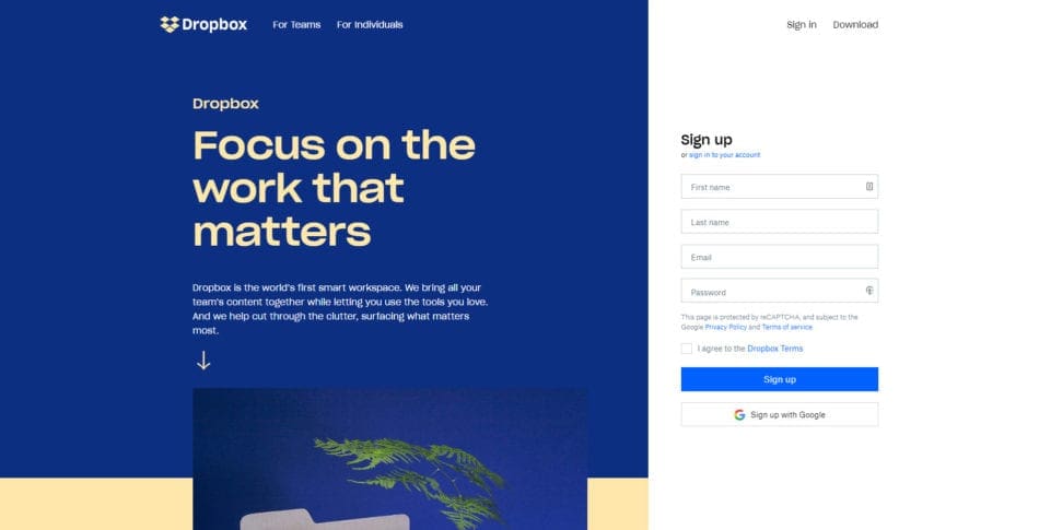
Tip 8: Avoid Stock Photos
While a blog may get away with using stock photos, your brick and mortar business can not. Stop being cheap take photos of yourself doing work in your business. Not only has it been proven to enhance the link between you and the visitor but it’s been proven that people look away from the stock photos.
Some studies have shown that when people are looking at the page, their brain will ignore stock photography all together once it knows it is a fake. Because of this more and more businesses are moving away from it. There is a push for photography photos to be less campy which has increased in the past few years.
But the key is to avoid any photo that isn’t pictures of you or your staff.
Tip 9: Photos with people convert better than photos without

Photographs that use pictures or faces of people convert better than graphics that have no people in them. So when in doubt make sure you add a person to that photo you want to add.
Also another clever way to use this technique is to make sure the person is the photo is looking at your content. They have shown it in heat maps that people will stare toward where a person is looking. So if you want to be a sneaky marketer you can use this tip to your advantage to draw attention to something important.
Tip 10: Avoid Long Paragraphs of text
When people are searching the web they are looking for quick answers and solutions. While people look at the long form content such as this, in most cases they want to skim. If you read any writing course for the web, you will learn that people skim more than anything else when they are on a website.
So make your content digestible by breaking the traditional rules of writing and following this simple rule. Never make paragraphs over two or three sentences. The shorter the better, be very direct in your writing. And finally, get to the point, people don’t want long-winded explanations.
Break up text with interesting images, facts, quotes, infographics, charts and more to keep the reader interested in your content.
Tip 11: Use Social Proof on your Pages

Pages that include social proof or quotes from customers get visitors interested in your content. Typically, this will only work for service pages but there has been the argument in blogging that lots of comments on post helps the post rank better. Google has never shown that there has been proof of this other than a very minor page boost.
This doesn’t change the fact that if you are selling anything, then you will need social proof. People want to read people’s feeling about your service so let them but you help them see what they need to know.
Be careful not to abuse this, fake testimonials are just one of the many tricks of a black hat marketer and they appear unbelievable.
Tip 12: Use Arrows as Visual cues on a page
What works better than people in a photo? Arrows that point to where you are trying to show off to your visitors. Arrows have been shown time and time again to convert people’s focus to whatever they are pointing at.
A word of caution, I would use this method sparingly and not all over your page. Try to limit the use to one or two times on the website as not to overuse it.
Tip 13: Use very strict font rules
Do not go overboard on the number of fonts on a website. Not only do these fonts add more requests to a website which can slow down your site but over two fonts creates chaos on a page.
The typical website has one font for headings and one font for the body. You could extend that to have two fonts for contrasting headlines and one font for body but I wouldn’t deviate from that unless you are trying to make an artsy website and even then, I wouldn’t.
Another tip I can give you is when you are creating your web design sheet use consistent font sizes and make sure these are consistent from desktop to mobile. Don’t assume a font will scale well on mobile, make sure you check so you don’t run into your designing breaking over some bad font choices.
Tip 14: Make sure your Design is Responsive
If you are someone brand new to design, then responsive means that the design will shrink or expand to meet the real estate of your screen size. Google has made a huge push to punish those websites that are not responsive by showing them less in the rankings.
Good news is almost every theme, page builder, or software on the planet allows for responsive designs. It’s so common that I don’t understand why they even advertise it anymore, it’s like saying a gas station sells gas.
Tip 15: A/B Test your Headlines and Pages
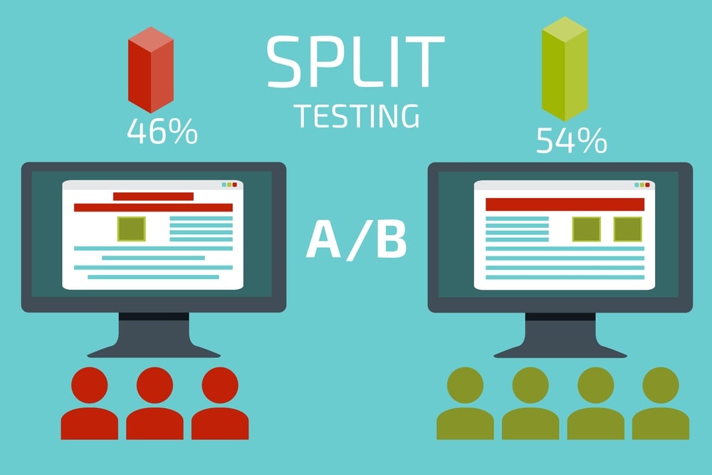
If you aren’t using some kind of software to test your headlines or pages, then you might want to start now. Doing a simple monthly test can increase conversion rates of visitors and also help you learn what they are looking for on your website.
A/B testing will also make sure that your headlines give you the most amount of impact for your buck. Having good headlines means that your message better reaches your customers’ desires which play a large part in web design.
Conclusion
I hope this list will help you make better design chooses for your website. I wanted to stick to things that you can control and edit and not things you have no clue about. These are all pieces of design that matter in the long run and use them when you are building your website.
If you like this content and you want to read more about web design, then please check our website.